It’s here! Google have officially started rolling out the mobile-friendly update.
When we first reported the announcement a few weeks back, we had several customers asking what exactly the update would do.
Google had previously mentioned what would be involved, but it has finally been revealed how the update would work – see below.
- Google’s update will affect search rankings on all mobile devices
- The update will affect search results in all languages, world-wide
The mobile friendly update will target ‘desktop-only’ formatted websites. Below is an image of a desktop website (left) displaying on a mobile device, compared to a mobile-optimised website on the right.
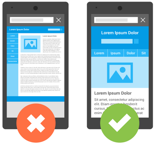
The desktop version of a website can be difficult to view and use on mobile devices. The non mobile-friendly website requires the user to pinch or zoom in order to read the content. Users find this a frustrating experience and are likely to abandon the site. Alternatively, the mobile-friendly version is readable and immediately usable.
Since we first reported on the mobile friendly update, our customers have been asking questions of what will happen to their website, so we have listed some of the more frequently asked questions below.
1. Will desktop and/or tablet ranking also be affected by this change?
2. How do I know if Google thinks a page on my site is mobile-friendly?
Individual pages can be tested for “mobile-friendliness” using the Mobile-Friendly Test.
3. My mobile-friendly website won’t be ready until after April 21st. How long before it will be considered mobile-friendly in ranking?
Google determines whether a page is mobile-friendly every time it’s crawled and indexed.
Once your website is mobile-friendly, you can wait for Googlebot for smartphones to naturally (re-)crawl and index your site or you can expedite processing by using Fetch as Google with Submit to Index in Webmaster Tools.
For a large volume of URLs, consider submitting a sitemap.
4. Does Google give a stronger mobile-friendly ranking to websites using Responsive Web Design (which uses the same URL and the same HTML for the desktop and mobile versions) vs. hosting a separate mobile site (like www for desktop and m.example.com for mobile)?
No, mobile-friendliness is assessed the same, whether you use responsive web design (RWD), separate mobile URLs, or dynamic serving for your configuration.
5. What if my audience is desktop only? Then there’s no reason to have a mobile-friendly site, right?
Not exactly. Statistics show that more people are going “mobile only.” The mobile-friendly update will apply to mobile searches conducted across all sites, regardless of the site’s target audiences’ language, region, or proportion of mobile to desktop traffic.
Mobile is critical to your business and will continue to be so. Make sure visitors can have a good experience on your site when they’re visiting from their mobile devices.
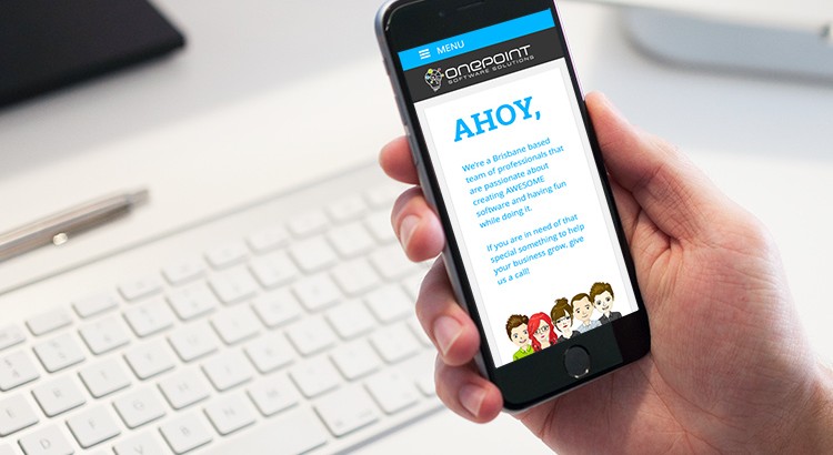
If you are looking at upgrading your current website to a responsive, mobile-friendly site, OnePoint Software Solutions can help you out. Simply give us a call on 07 3444 0045 or contact us here.


![10 Must-Have Features for Tradie Websites [Guide] by OnePoint Solutions](https://onepointsolutions.com.au/wp-content/uploads/2024/01/10-Must-Have-Features-for-Tradie-Websites-768x576.jpg)