
With Google’s change to their search algorithm it’s now crucial that your website needs to be “mobile friendly”. But did you know there are different types and definitions?
We often get asked by clients about what is the difference between a mobile website and a responsive website and to add to that, which is the better option?
So to help our customers understand the difference, we have described each and listed the pros and cons below.
Mobile Design Website
Mobile websites are generally a copy of your main website which have fewer pages, and those pages are built specifically to format on the mobile phone.
Pros
- User experience – You have a website that is specifically optimized for mobile devices, so you have a good ground to create a beautiful and usable UX.
- Speed – Your website will load fast and easily on mobile platforms.
- Benefit from local search – Search engines tend to provide good UX nearly as much as you do, so in local search results mobile optimized websites have better chances to rank.
- Immediately accessible – Though not an extra advantage over responsive websites
Cons
- Maintenance & Updates – You will have to maintain two websites.
- Multiple URLs – Your customer has to remember at least two URLs, or otherwise be redirected to the mobile website, which takes several seconds. The mobile website will need additional SEO work as well.
- Universal Compatibility Issues – Remember that there are two different types of mobile devices: touchscreen and keyboard navigation. A single mobile website won’t look and work the same way across all device types.
- Cost – In the past, building a mobile website is was a cheap option, but with improvements in technology, why pay for the design, development and upkeep of two websites when you only need one.
Responsive design
Responsive means that you have one website which is specially designed and coded so that the content reformat’s to suit the device (tablet, mobile phone or desktop).
Pros
- A Single Website – It’s easier to administer just one website for all devices.
- Google Site Index – Google only has one website to index instead of a desktop and a mobile site.
- A Single URL – This makes sure your users will find you on mobile devices without having to wait for redirects, which is helpful on slower connections.
- Lower Your Mobile Bounce Rate – Responsive Design can ensures your web design is suitable for all devices and therefore stands the best chance at keeping your visitors for longer.
- Easy SEO – You can enjoy the benefits of your desktop website SEO on mobile devices.
- Low Cost – Simple math — one website is cheaper than two.
- User Experience – A seamless user experience, if the site is built well.
Cons
- User Experience. Mobile is a completely different experience than desktop, so having a single website, may harm your overall UX (User Experience) if not designed well.
Fluid Responsive Websites
When we look at a fluid website layout, the majority of the components have percentage widths, and therefore adjust to the user’s screen resolution.
Adaptive Responsive Websites
Adaptive design is essentially for you to see the right version for your particular device. Adaptive websites introduce media queries to target specific device sizes, like smaller monitors, tablets, and mobile.
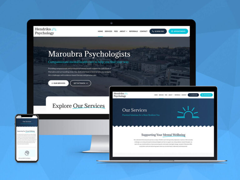
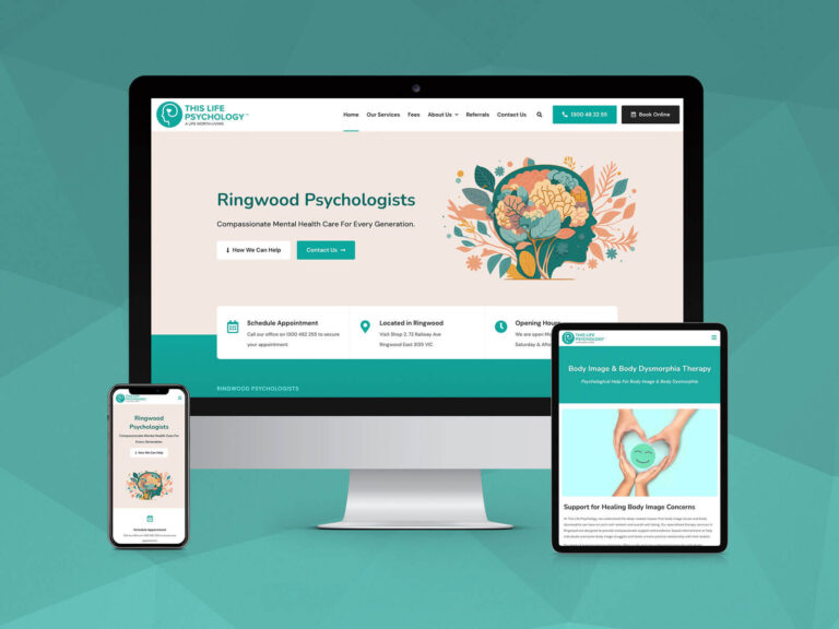
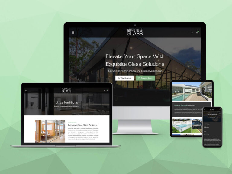
Below, an image via Reddit.com – shows the activity we do to check if a site is fluid responsive or fixed variant responsive.
Check If Your Website Is Responsive!
Below we have attached an image that shows the activity we do to check if a site is fluid responsive or adaptive, or not responsive.
Starting to panic about Google’s new mobile-friendly update?
Don’t stress. Simply call us today on 07 3444 0045 and let us help!

